Case Study · 2020
Ghana Gold Expo
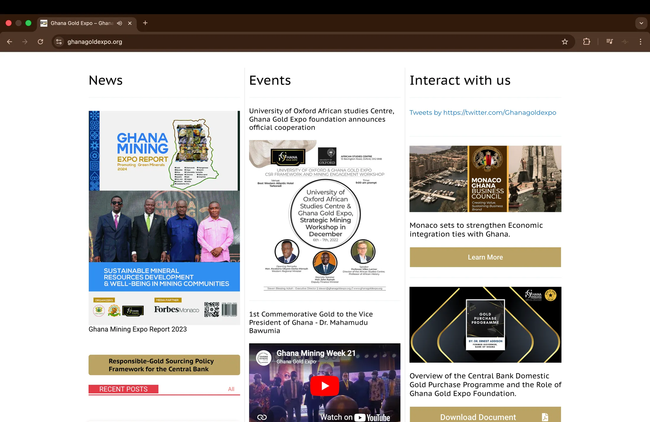
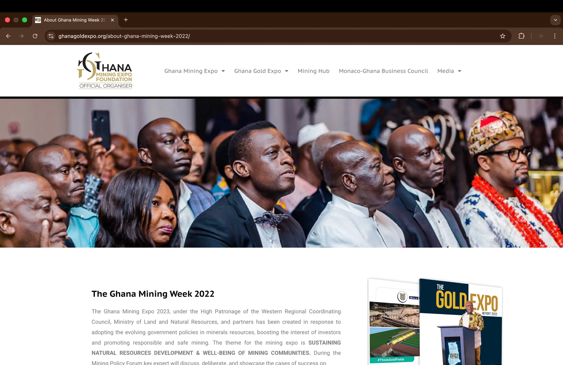
Ghana Gold Expo is a premier platform that brings together government, industry leaders, investors, and international partners to showcase Ghana’s rich mineral resources and create sustainable opportunities across the mining value chain. The expo serves as a meeting point for dialogue, investment, partnerships, and knowledge sharing, while promoting responsible mining, innovation, and long-term economic growth for Ghana and the wider region.



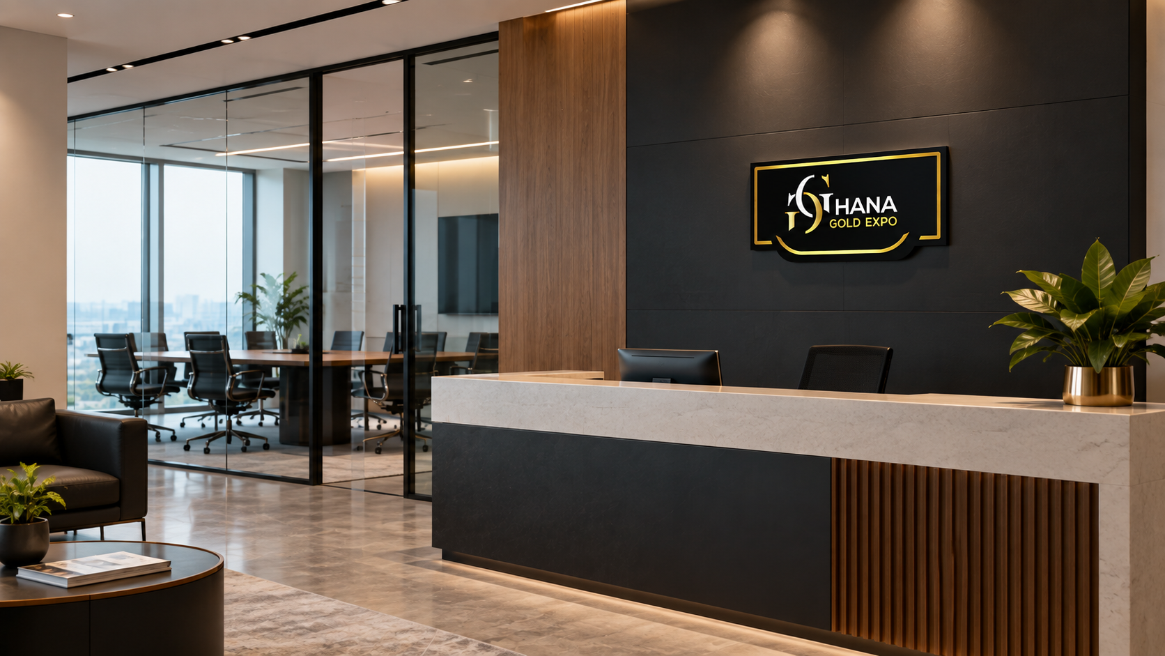
The Logo
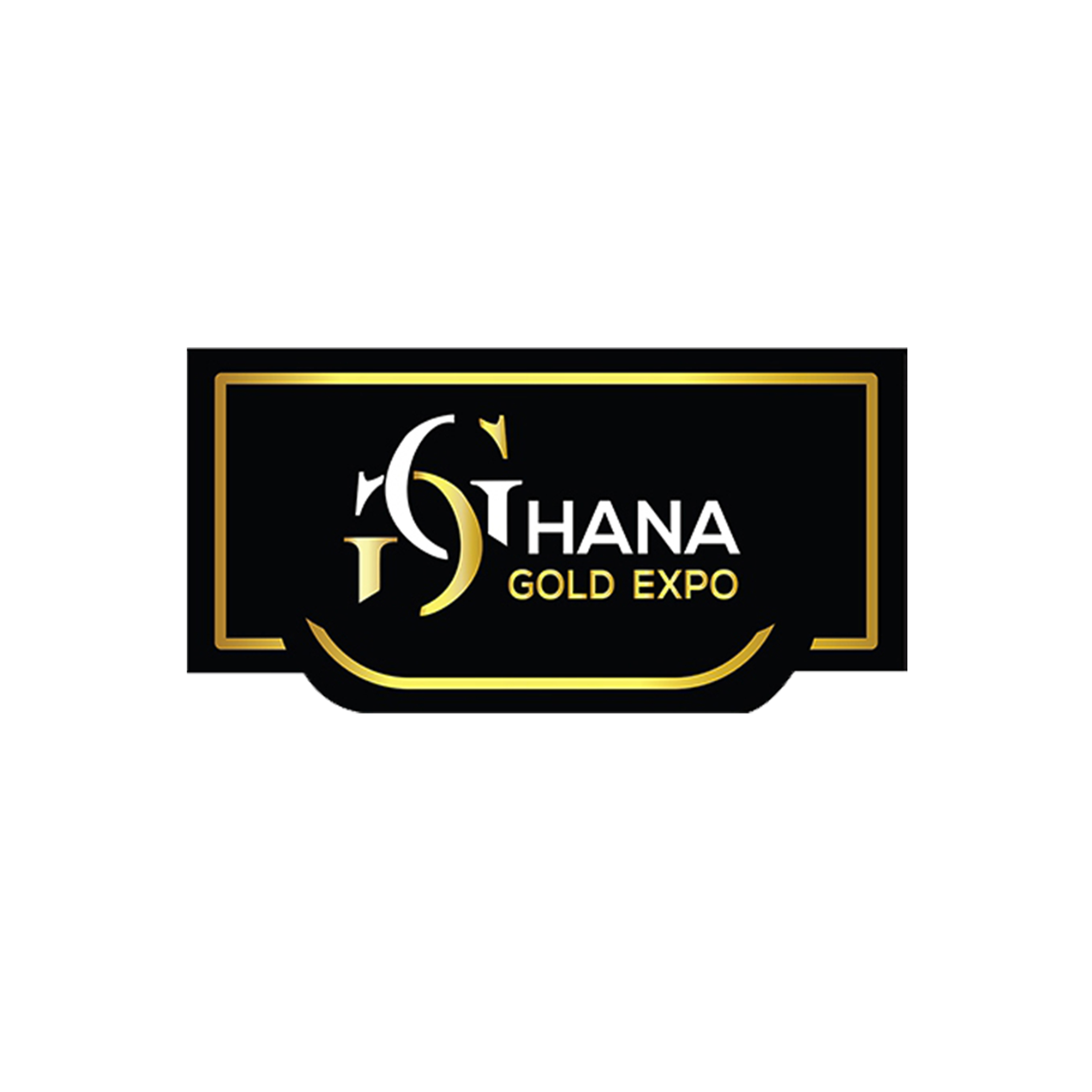
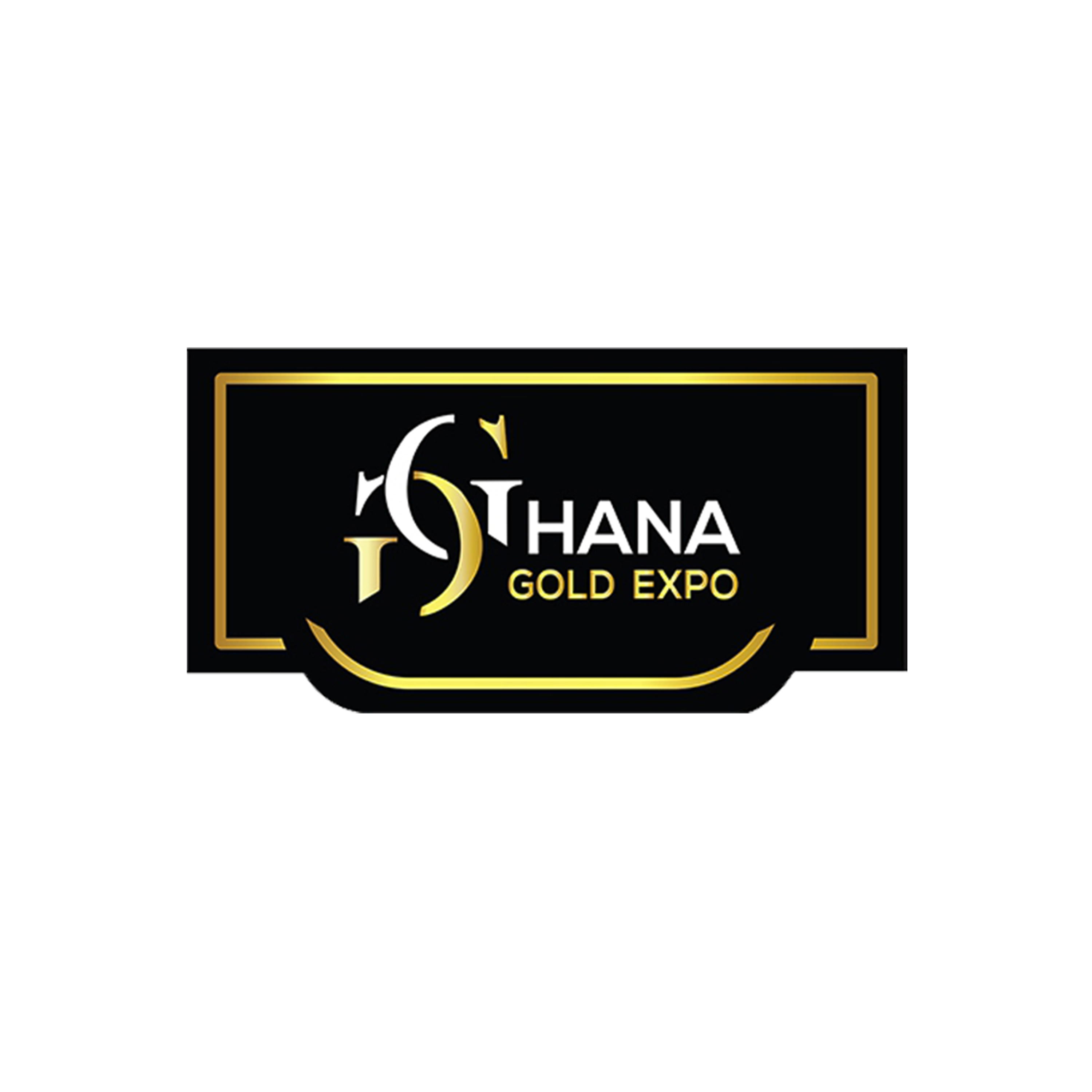
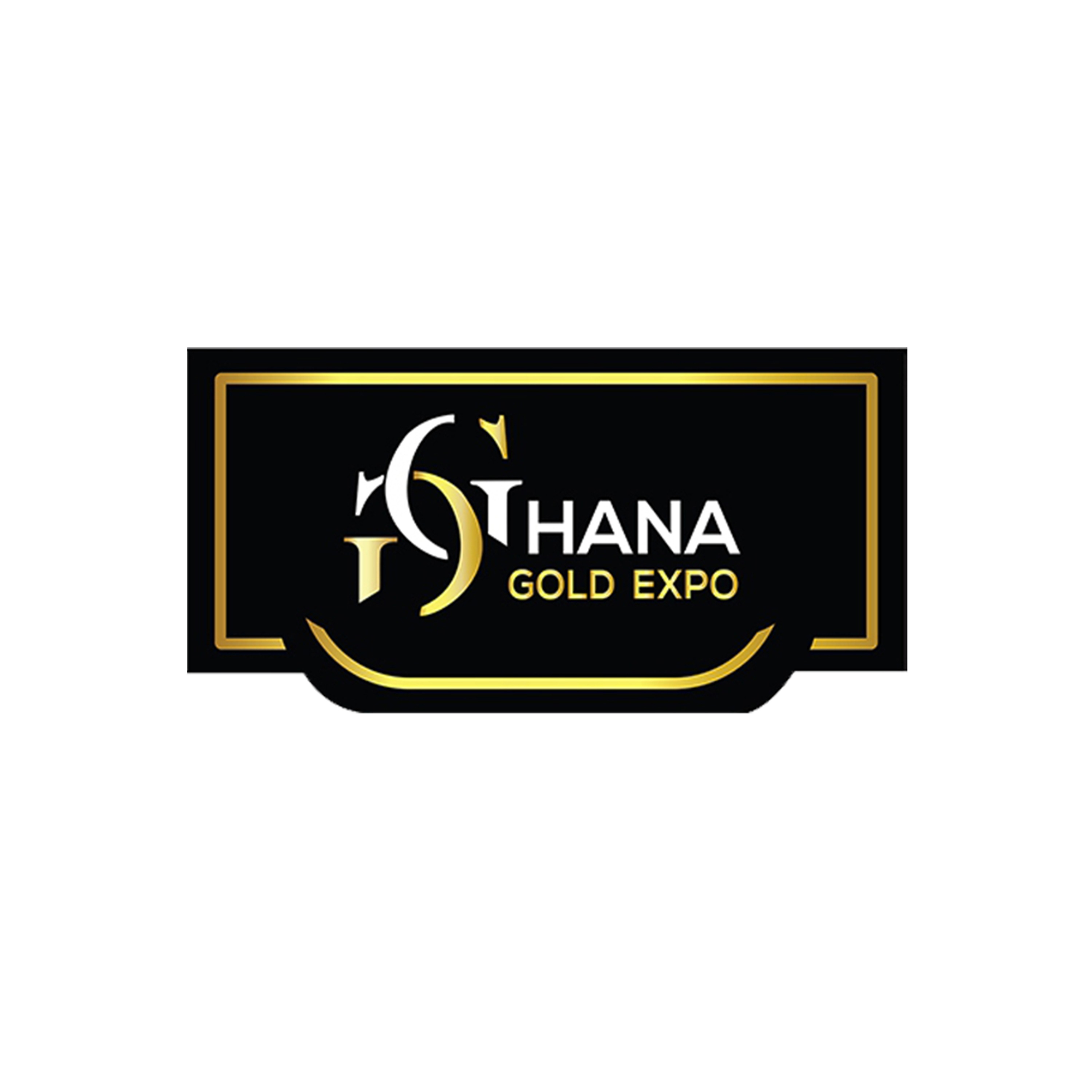
The Ghana Gold Expo identity was developed to reflect its role as a platform for investment, collaboration and sustainable growth within Ghana’s mining sector. The interlocking emblem represents connection, exchange and forward movement, while the black, gold and white palette gives the brand a premium, authoritative and internationally relevant presence. The sweeping forms reinforce ideas of partnership, opportunity and long-term growth.
Color
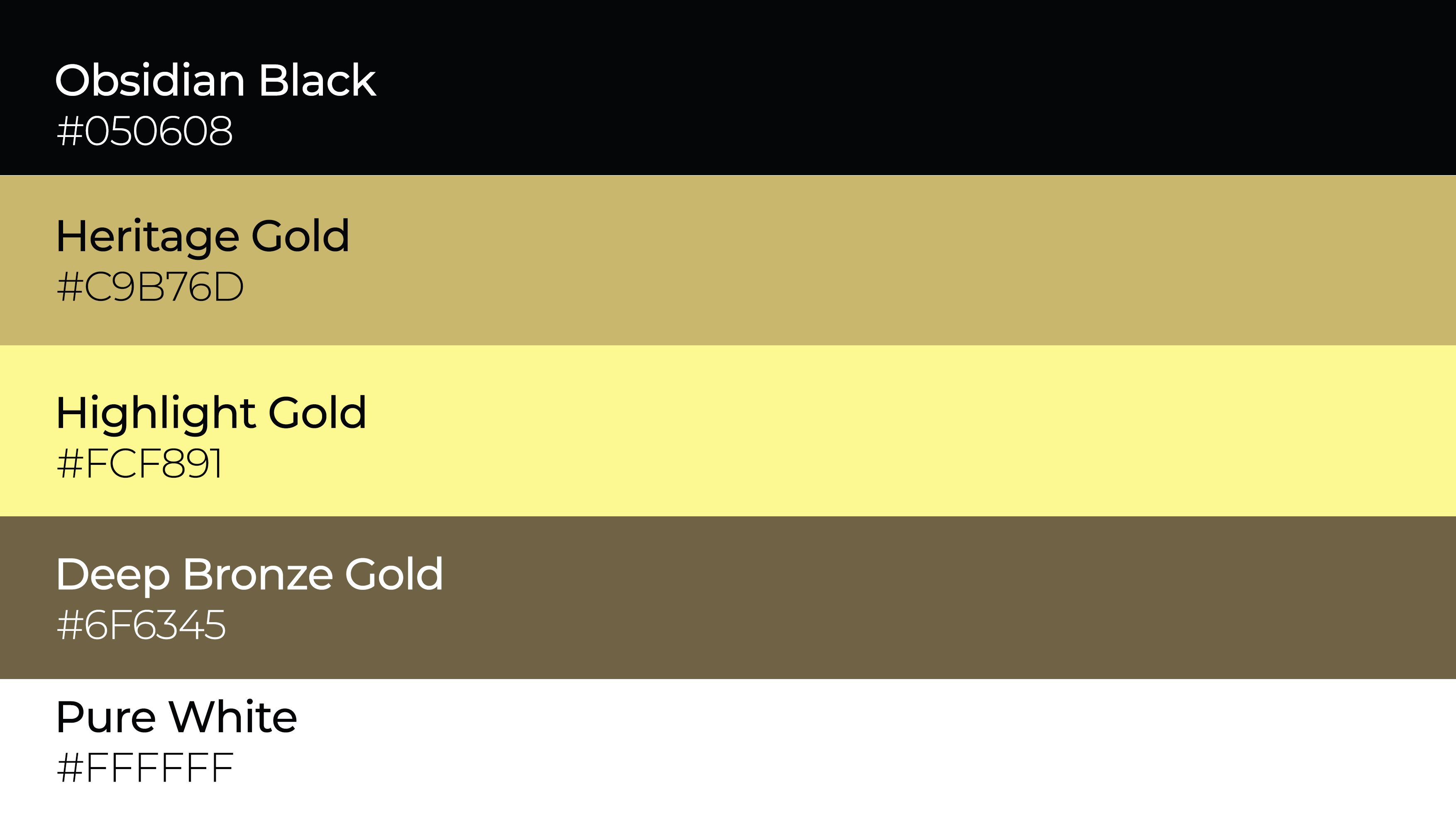
The black, gold and white palette reflects both Ghana’s gold industry and the Expo’s international stature. Gold represents value, prestige and opportunity, black adds authority and credibility, while white brings clarity and balance. Together, they create a premium, professional identity that feels directly connected to the sector.
Typography
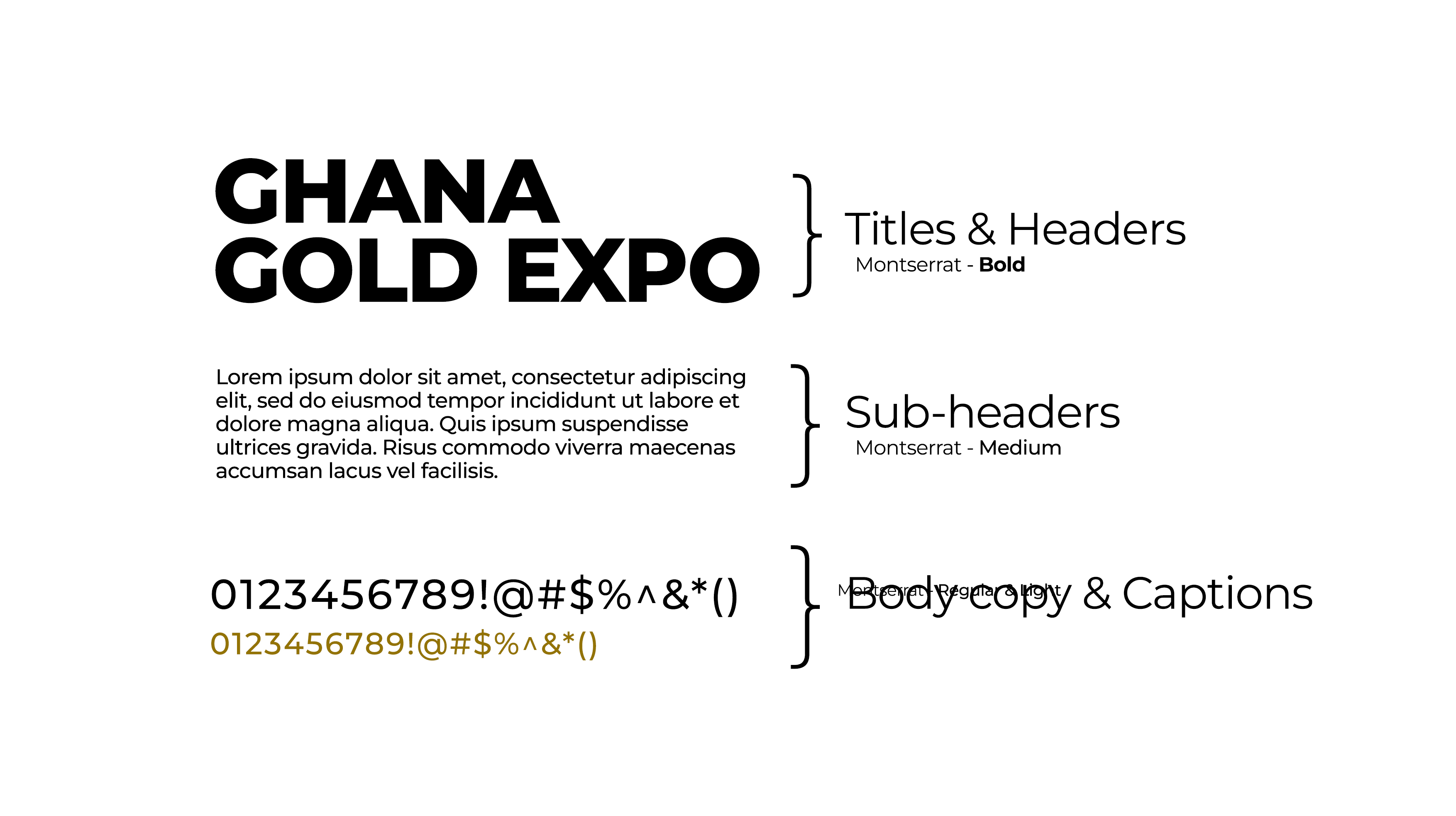
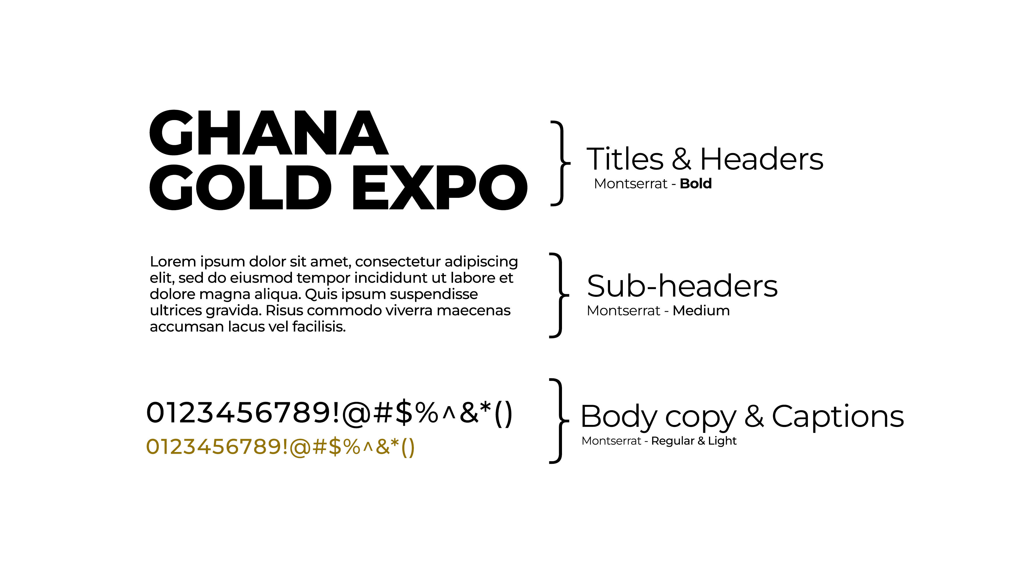
The typography was chosen to give Ghana Gold Expo a strong, contemporary and professional presence. The uppercase sans-serif structure communicates authority and credibility, while generous spacing keeps the identity clear and legible across different applications. The bold emphasis on “GHANA” establishes national prominence, with “GOLD EXPO” supporting it in a lighter hierarchy for a balanced, modern institutional look.
The Real Challenge
The challenge was to represent Ghana’s gold industry without making the identity feel predictable or overly luxurious. The logo needed to communicate value and prestige while also presenting the Expo as a credible platform for business, investment, responsible mining and international engagement. The result is a distinctive, professional identity designed to work consistently across events, publications, digital platforms and stakeholder communications.
The System
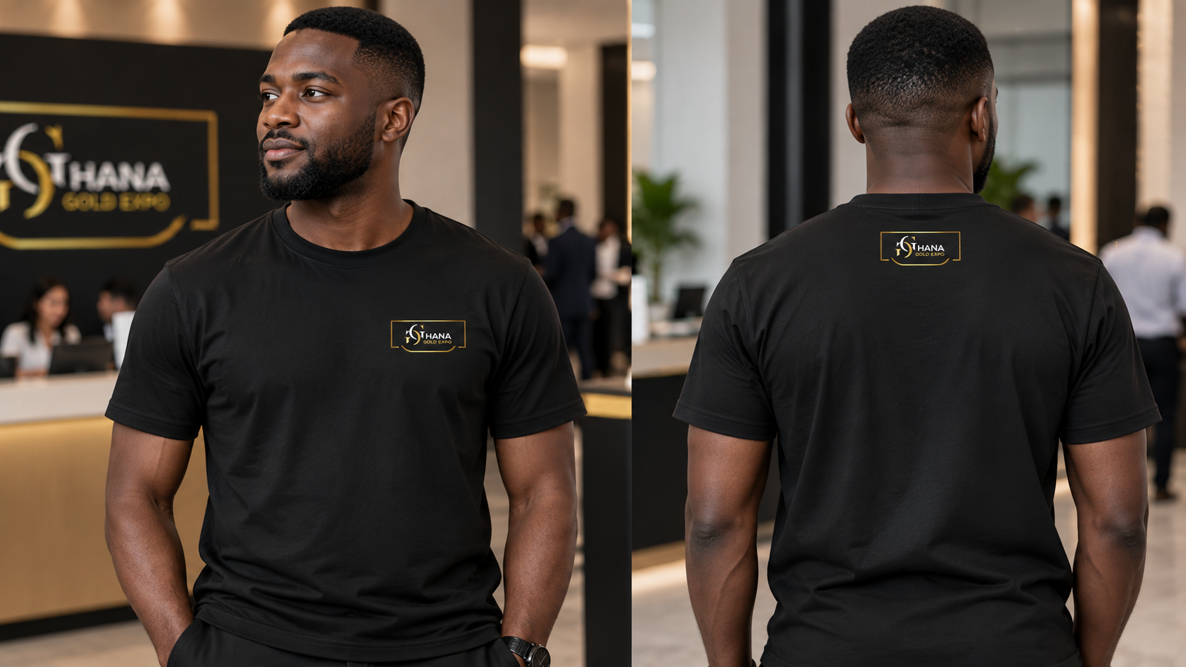
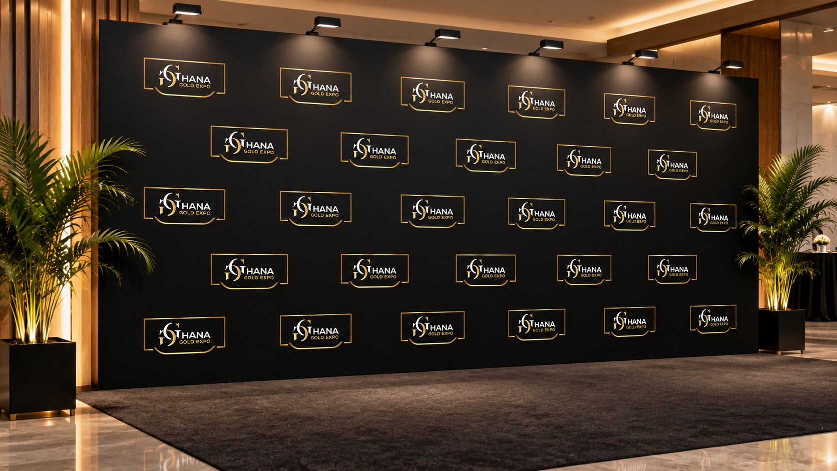
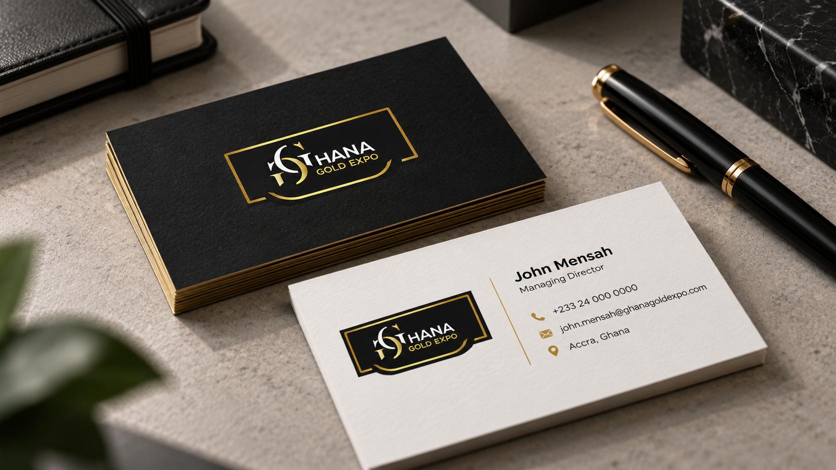
The Ghana Gold Expo identity was built as a flexible visual system, not just a logo. Its mark, black-and-gold palette and typography create a consistent foundation that works across events, publications, digital platforms, campaigns and stakeholder materials. The system is designed to stay recognizable while adapting to different applications, giving the brand a cohesive, scalable and professional presence.
Where it started
Ghana Gold Expo brings together government, industry leaders, investors and international partners to showcase Ghana’s mineral resources and create opportunities across the mining value chain. The platform supports dialogue, investment, partnerships and knowledge sharing while promoting responsible mining, innovation and long-term economic growth.
Start a project
Need a project like this built carefully?
Contact the studio to discuss brand identity, website design, campaign work or digital product support.
Start a conversation